
5 Summer Colour Schemes to Inspire Your Home | Roomes
We understand the hesitation that often comes with wanting a summer refresh for your home, many people wonder if the colour schemes they use will remain relevant and retain their charm all year round.
Top tip from our Interior Design Team: If you don’t want a big change but are looking for a simple update, consider upholstered living or dining chairs, cushions, throws or curtains in the shades we recommend rather than painting your walls. This can give you the quick refresh you need!
Here’s our recommendations for creating a beautifully considered summer colour palette that will make your home feel refreshed for the summer and still keep it looking inviting all year long:
1. Pastel Shades
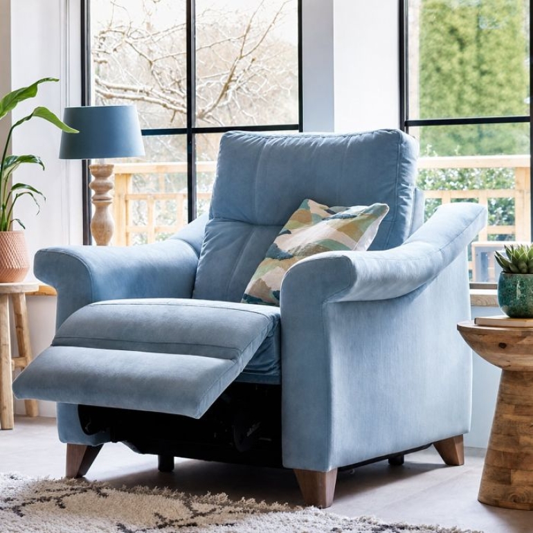
This one is always a top contender. Think light blue, dusty pink, soft lavender and buttery yellow.
These colours give your home a beautiful English country garden look and feel in the summer, and also provide a softly colourful escape from the dark winter months later in the year.
“For the best results, choose one or two pastel colours and pair with variations of the shade around your home for a cohesive look,” suggests Holly Ambrose, our Head Interior Designer.
![]()
2. Colourful Palette
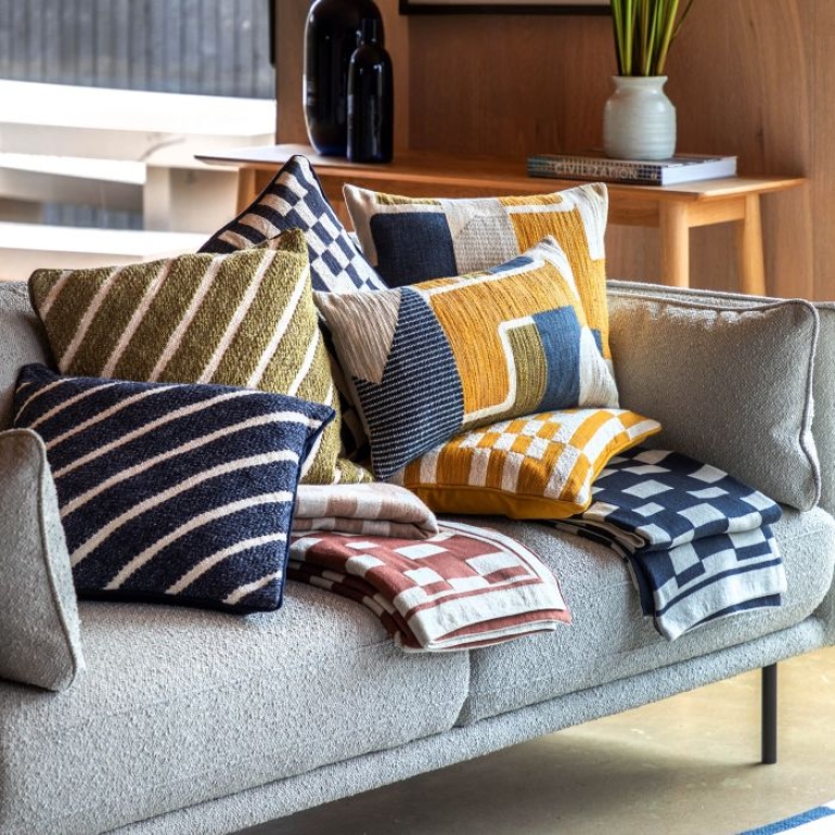
These colours inject energy into your space, making them an ideal summer choice; whilst remaining bright and uplifting in the colder months. Consider brighter or richer shades of colours like blue, green, red or orange.
“Work in shades of the colour that stand out, along with more toned down versions of the same colour to create a varied effect,” suggests Lauren Perrett, Design Consultant.
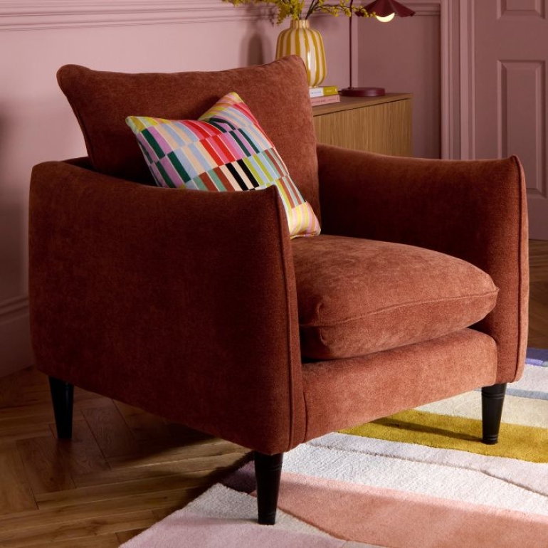
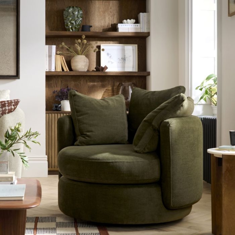
Shades like burnt orange, jade or leaf green, rich sapphire blue, or deep maroon have a unique ability to ground a room while still looking luxurious. We recommend looking at sofas or chairs from The Lounge Co or Vogue Williams to create this look.
Alternatively, look at our Home Decor for bright injections of colour whether through pictures, cushions or faux flowers.
![]()
3. Neutral Shades
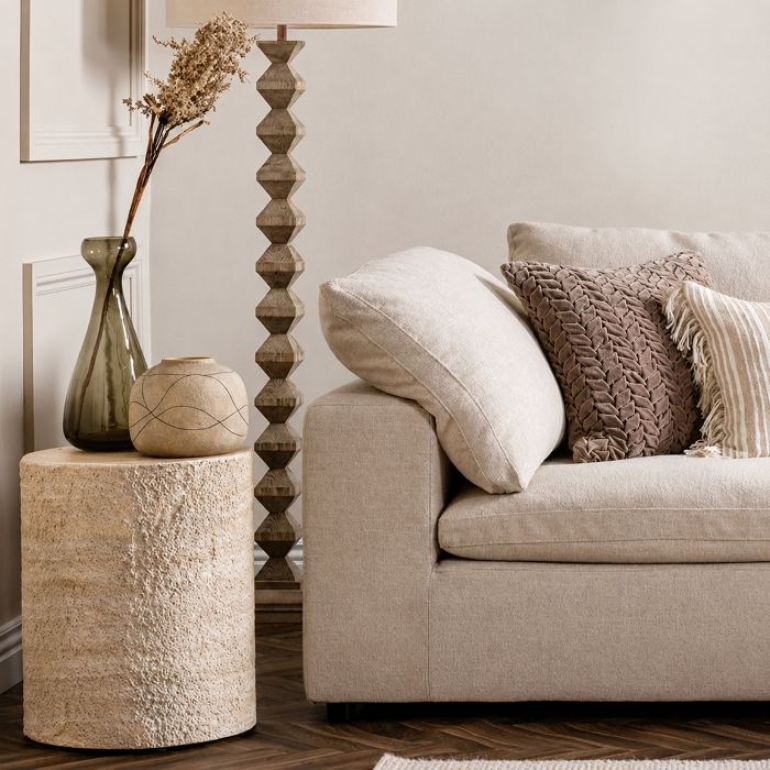
Neutral shades like beige, cream, brown and light grey work in any home. Neutral walls or sofas can be the perfect backdrop for other small and subtle pops of colour. Explore our ‘Neutrals and Naturals’ section in store to find exactly what you need.
Our Design Team recommends pairing neutral sofas with warm brown tones - whether through rugs, or rich wood coffee tables and lamp tables.
With colour theory institute Pantone having named a breezy white ‘Cloud Dancer’ shade as their colour of the year for 2026, neutrals are definitely the way to go if your home wants to look welcoming all year - simply switch out smaller accessories as needed. Vases and abstract wall art of neutral tones work perfectly in a contemporary home that has a laid back feel.
![]()
4. Earthy Tones
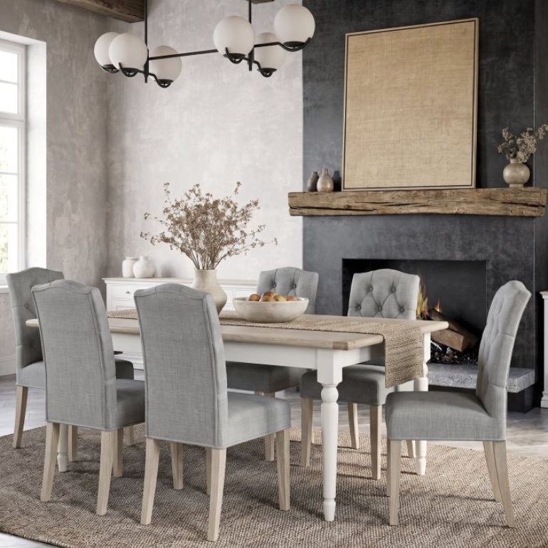
Relaxing and inviting all year round, an earthy colour palette is timeless. Simply take inspiration from nature when you pick your colours - go with a couple that complement each other if you’re interested in variation.
“Any rich and leafy shade of green goes wonderfully with brown,” suggests Holly. “Sunny, light or buttery yellows are also a year-round favourite especially for living rooms or kitchens!”
Our other suggested earthy colour pairings include grey-green with blue green, or sandy brown and white colours with subtle taupe. Sage green or terracotta shades are also a beautiful and softly uplifting choice.
Look at our guide on Biophilic Design for more inspiration.
![]()
5. Coastal Theme
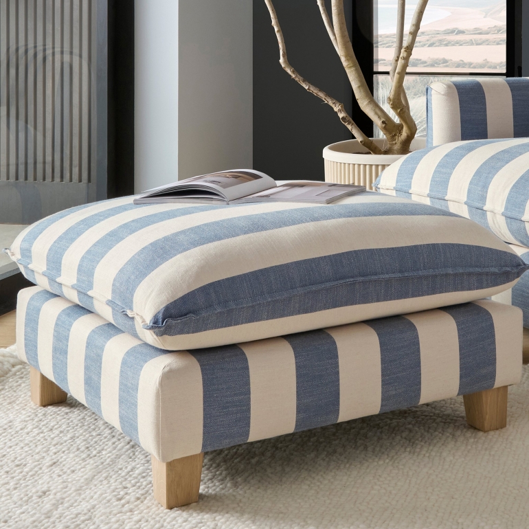
Various shades of blue mixed together create a soothing ambience in the home, and its association to colours of the ocean make it a summer favourite. Depending on the other colours you decide to work in, your home could make coastal colours look chic in any season.
Look at our article on Why Coastal Chic Isn’t Just for the Summer for more inspiration.
Our Design Team recommends being careful not to overdo the blue. “If shades like seafoam green and sandy white are added in, it can make your space appear more considered,” suggests Lauren.
For a richer and more luxurious coastal theme, choose shades like turquoise, pebble brown, deep blue and crisp white.
![]()
Separate elements from each colour scheme can also be used together to complement each other, for example - earthy tones could be paired with coastal and neutral settings, or vibrant and pastel shades could be tied in together.
If you need guidance to help bring your summer colour palettes to life in your home, book a consultation with our Design Team here, or simply visit Holly and Lauren in store in our Interior Design department - they’re always ready to welcome you.
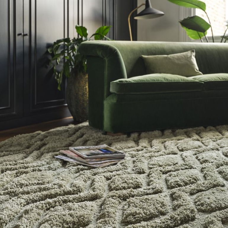
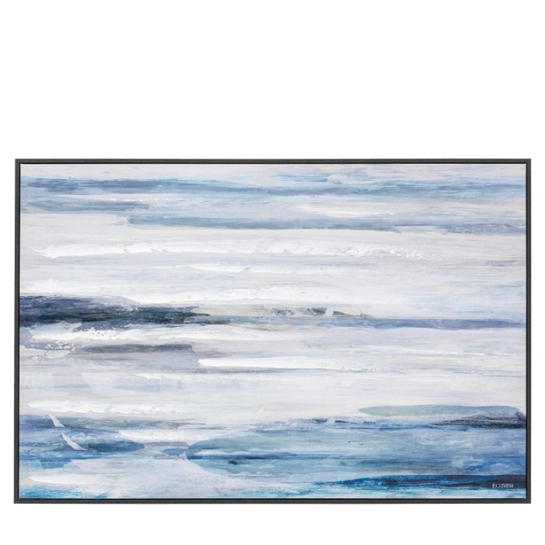
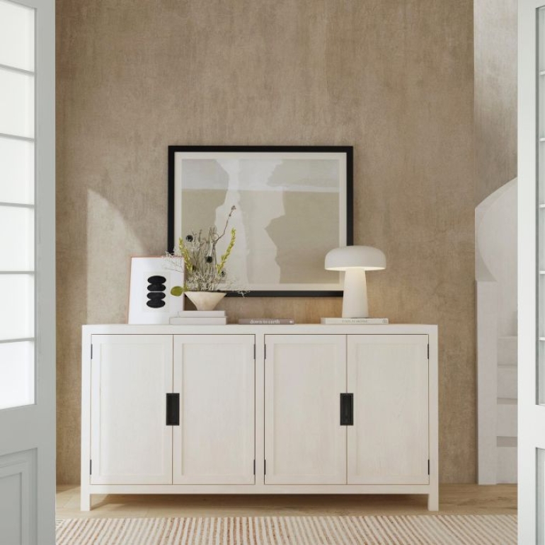
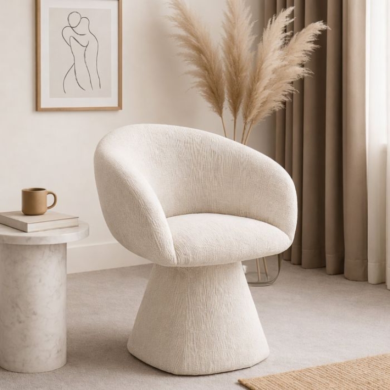
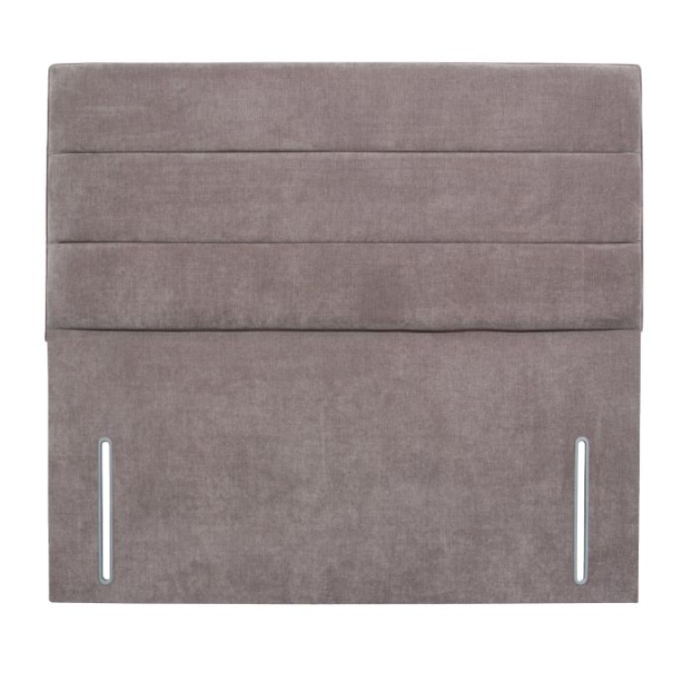
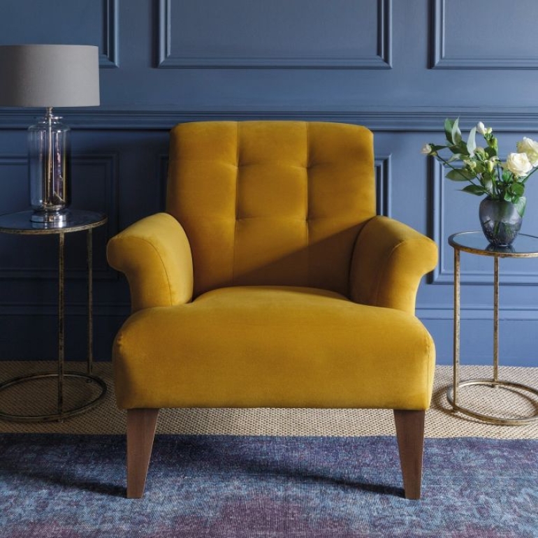
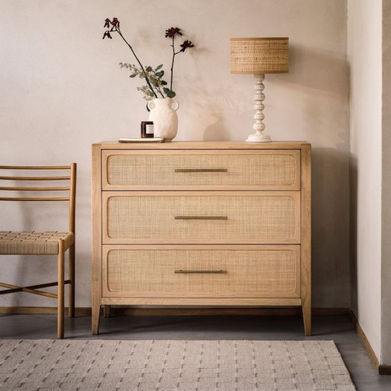
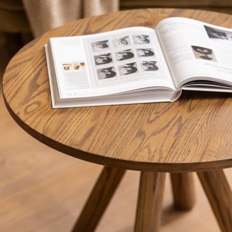
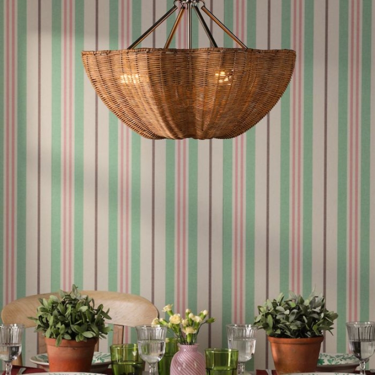
Here’s a selection of our top picks in these colour palettes to help you get started:
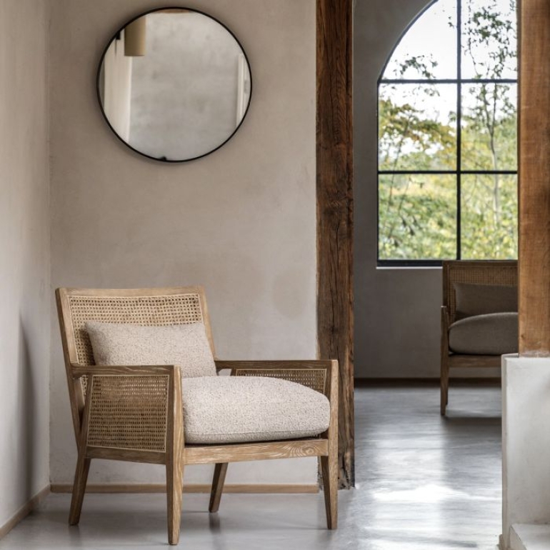
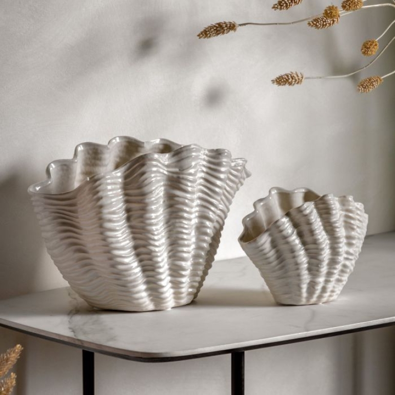
Frequently Asked Questions...
How can I make a neutral colour palette feel summery?
Give neutral interiors a lighter summer feel by layering warm whites, creams, beige and soft natural shades. Introduce linen, cotton, light woods and woven textures to add interest and keep the room from feeling flat. Greenery and a few carefully chosen accessories can provide subtle contrast while maintaining a calm, considered look.
How can I use vibrant colours without overwhelming a room?
Choose one or two vibrant shades and use them as accents against a more understated backdrop. Colourful cushions, artwork, occasional chairs, rugs or decorative accessories can bring energy to a room without dominating it. Repeating your chosen colours in a few places throughout the space will help the scheme feel intentional and well considered.
How do I create a coastal colour palette without making my home look too themed?
Start with soft whites, sandy neutrals and shades of blue, then introduce natural textures for a subtle coastal influence. Light woods, woven accessories and relaxed fabrics work particularly well. Rather than relying on obvious seaside motifs, take inspiration from the colours and textures of the coast for a more timeless look.
How can I incorporate some earthy colour palette changes into my home?
Take inspiration from nature with warm terracotta, clay, olive green, sandy beige and rich brown tones. Pair earthy colours with natural materials such as wood, rattan and woven textures to create a warm, relaxed feel. If you don't want to redecorate completely, introduce earthy shades through cushions, throws, rugs and decorative accessories.
Can I mix different summer colour palettes together?
Yes. Combining elements from different palettes can make your home feel more individual. An earthy scheme can incorporate soft pastels, while a neutral room can provide the perfect backdrop for vibrant accents. Look for a common colour, material or undertone to connect the different elements and create a cohesive look.
How can I update my home for summer without redecorating?
Small seasonal changes can make a noticeable difference. Swap heavier throws and cushions for lighter fabrics, introduce summery colours through accessories and artwork, and add natural textures, flowers or greenery. Choosing a few pieces from your favourite summer colour palette is an easy way to refresh a room without changing your main furniture.
- 18th August 2026


