Pantone 2025: Styling Your Home with Mocha Mousse
Warm, rich, and effortlessly comforting, brown tones have long been associated with warmth and familiarity. Their enduring appeal lies in the way different shades can create unique atmospheres—whether softening a space or elevating it with understated luxury.
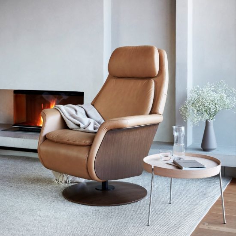
Named Mocha Mousse by the Pantone Colour Institute as the Colour of the Year 2025, this rich, earthy brown is designed to evoke emotion. It recalls the warmth of your first sip of tea or coffee, or the subtle indulgence of a piece of chocolate—everyday moments that bring comfort and contentment, or the comforting ritual of slowing down at home. It is a colour that feels instantly familiar, yet undeniably refined.
![]()
Who are Pantone and why is it relevant?
Pantone is widely recognised as the leading global authority on colour. Setting the official standards that millions of designers, manufacturers and creatives rely on worldwide, their influence reaches far beyond the design industry. When Pantone names a Colour of the Year, it signals a shift in mood, lifestyle and design direction on a global scale.
For the home, this matters more than many realise. Pantone’s selections act as a powerful trend accelerator, shaping everything from paint colours and upholstery to soft furnishings and decorative accessories. Their choices quickly filter into interiors, influencing what feels current, desirable and enduring.
Why Mocha Mousse Is Pantone’s Colour of the Year 2025
Pantone Executive Director Leatrice Eiseman describes Mocha Mousse as “an expression of thoughtful indulgence, underpinned by our desire for everyday pleasures.”
She adds:
“Sophisticated and lush, yet at the same time an unpretentious classic, PANTONE 17-1230 Mocha Mousse extends our perceptions of browns from being humble and grounded to embracing aspirational and luxe.”![]()
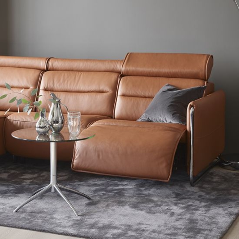
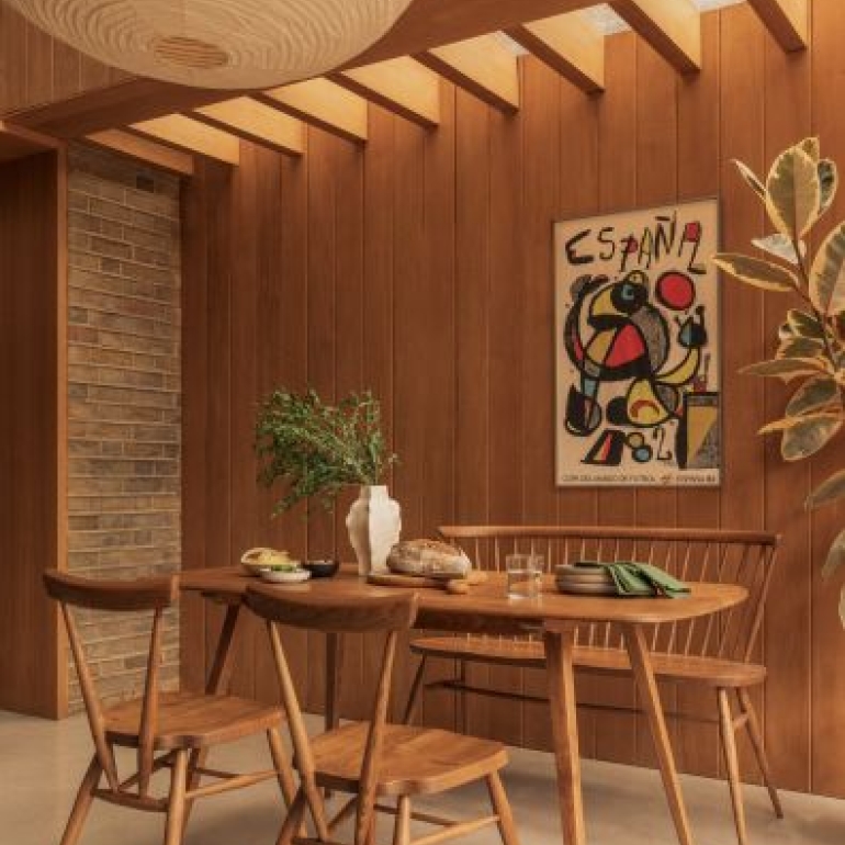
Mocha Mousse pairs beautifully with a wide range of tones as a grounding base. Soft creams and warm neutrals enhance its richness, creating calm, inviting spaces that feel both cosy and refined.
Tan and caramel hues work particularly well to emphasise the warmth of the colour, adding depth and continuity across furniture and accessories.For a more layered, design-led look, muted purples and dusky blues introduce contrast while maintaining a sense of elegance.
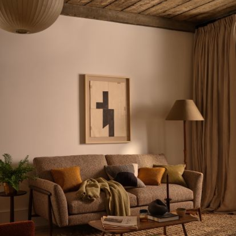
Blush pinks and earthy greens add subtle freshness, helping to balance the depth of Mocha Mousse and prevent interiors from feeling too dark or heavy.
![]()
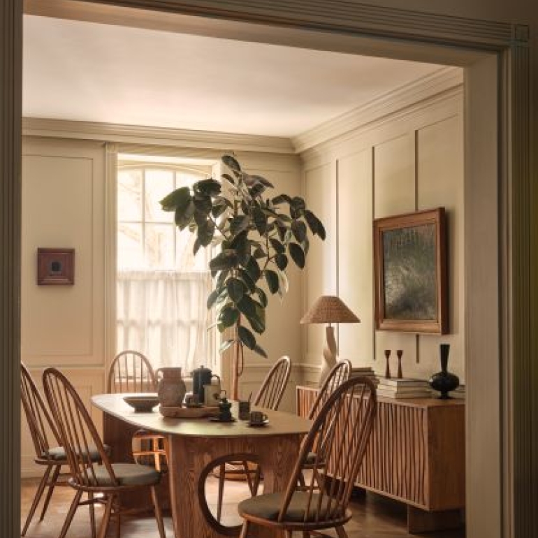
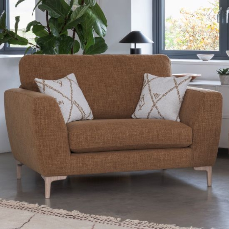
Discover Mocha Mousse Furniture at Roomes Furniture & Interiors
Whether used as a focal point or layered subtly through textures and materials, these shades help create interiors that feel curated yet comfortable - designed for real living.
There’s no better place to explore this trend than Roomes Furniture and Interiors. Our collections feature deep brown dining tables, coffee and lamp tables, as well as cabinets and sideboards in wood finishes and luxuriously upholstered sofas and armchairs in neutral shades - inspired by the Mocha Mousse palette, allowing you to bring Pantone’s Colour of the Year 2025 effortlessly into your home.
Whether you’re updating a living room, bedroom or dining space, our carefully curated pieces are designed to suit a wide range of tastes and interiors.
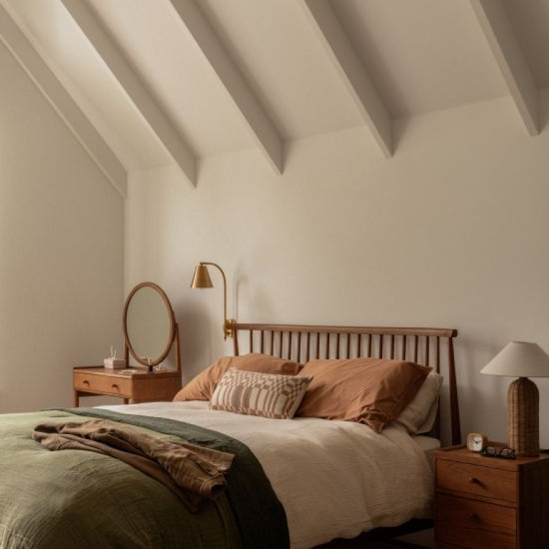
Embrace Winter Warmth with Pantone 2025 Interiors
As 2025 draws to a close and winter sets in, now is the perfect time to introduce Mocha Mousse tones into your home. Brown interiors have a unique ability to feel grounding and luxurious all at once, making them a timeless choice for the modern home. Richer brown tones naturally lend themselves to cosy interiors, especially when paired with soft furnishings, layered textiles and warm lighting.
Browse our Pantone 2025 edit online or visit our Upminster showroom, where our friendly furniture experts can guide you through our Naturals & Neutrals section to help you find the perfect piece for your space.
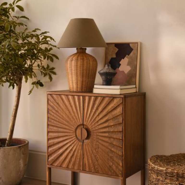
Styling Mocha Mousse: DOs & DON’Ts
- DO layer warm, tactile materials
Use leather, velvet, woven wool and rich natural woods to enhance Mocha Mousse’s depth and create a space that feels cocooning, luxurious and lived-in.
- DON’T rely on flat or overly cool finishes
Avoid pairing Mocha Mousse with high-gloss surfaces or cool greys, which can drain warmth and disrupt the colour’s comforting, earthy character.
- DO balance with lighter neutrals
Soft creams, warm beiges and off-whites prevent Mocha Mousse from feeling heavy, helping interiors remain light, elegant and visually balanced.
- DON’T overuse the shade in small doses without contrast
Using Mocha Mousse alone, without lighter or textured elements, can make a space feel enclosed. Always introduce contrast through colour, texture or lighting.
- DO ground the space with statement pieces
Mocha Mousse works beautifully on sofas, armchairs, cabinetry or feature walls, where its richness can be fully appreciated and used to anchor the room
Looking Ahead: Pantone Colour of the Year 2026 – Cloud Dancer
Looking forward to brighter days, Pantone’s Colour of the Year 2026, Cloud Dancer, offers a light and breezy white that embodies calm and clarity. Described by Pantone as “a symbol of calming influence in a society rediscovering the value of quiet reflection,” this shade brings a fresh sense of balance.
Cloud Dancer works beautifully as a neutral base, enhancing other colours within your home. Soft creams and whites complement Mocha Mousse tones perfectly, creating a harmonious and uplifting interior.
Refresh Your Home for the Year Ahead
Cloud Dancer reflects a renewed appreciation for simplicity and balance. Renew the look of your home and source interiors that feel fresh yet grounded.
Explore our new home accessories to add subtle pops of colour that work seamlessly with Mocha Mousse and Cloud Dancer. Together, these shades create a bright, welcoming home—perfect for a new year filled with new memories.
![]()
- 15th December 2025


